Today:
- Scatterplot AKA bivariate plot
- Linegraph
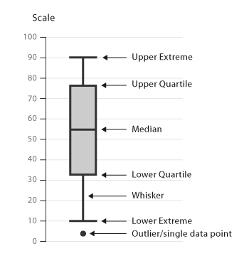
- Boxplot
- Barplot AKA Barchart AKA bargraph
- Histogram
Fri Sep 30, 2016
Today:
If I know your name, I can guess your age.
Breakdown of components.
You can compare distributions of values in different groups with a single line.
Look at the chart in this Planet Money article. In this case, you can compare cities with a single vertical line.
Before we lay out boxplots however, we have two digressions: