Last updated on 2017-05-15
Lec41 - Mon 5/15: Midterm III Review
Administrative
- Fri 5/19 7pm-10pm in Warner 506
- Not a final, but 3rd midterm. Timed at ~1h15m to 1h30m
- Bring your cheatsheets
- Bring a calculator or your smart phone with calculator app
Philosophy
- More conceptual in nature
- Code:
- Reading/understanding: Fair game
- Writing: No direct code to write, but pseudocode
- Normal curve of distribution of difficulty
Sources
- Lectures 01 through 38 inclusive and cummulative
- Slides from each lecture
- Learning Checks
- Problem set solutions!
Major Topics: Midterm I
- Tidy data. What are the components?
- What is the Grammar of Graphics? How do they tie in with
ggplot2? - What are the first four of the 5NG? What are their distinguishing features?
Major Topics: Midterm II
- All five of the 5NG
- Data manipulation/wrangling
- 5MV +
join - Putting it all together: Lec18 - Fri 3/24: The tao of data analysis.
- 5MV +
- Sampling, probability, confounding variables, and designed experiments.
Major Topics: Midterm III
- Hypothesis testing
- Lady tasting tea.
- There is only one test; it has 5 components.
- Confidence intervals
- Theory: Sampling distribution and standard errors
- Interpretation of CI
- If sampling distribution is normal, the general formula for creating a 95% C.I.
Major Topics: Midterm III
- Regression
- Regression line is best fitting line in what sense?
- Interpret ALL regression table outputs
- Study residuals
- Categorical variables
Multiple Regression
Lec39 - Thu 5/11: Multiple Regression
Recall
So far we've seen simple linear regression
- Simple means only one predictor/independent variable \(x\)
- Outcome/depedendent variable \(y\)
- \(x\) can be either numerical or categorical
Recall
In Lec 36 LC we saw the relationship between \(x =\) dep delay & \(y =\) arr delay for Alaska Airlines flights.

Today
- Since we only have Alaska flights, the variable
carrierdoesn't vary. - But now let's also consider Frontier Airlines (
carrier == F9)
So we have:
- \(y =\) arrival delay
- \(x_1 =\) departure delay (numerical variable)
- \(x_2 =\) carrier (categorical variable with \(k=2\) levels. In other words, carrier now varies.)
Today
Is there a difference in delays between Alaska and Frontier?

Today
Is there a difference in delays between Alaska and Frontier?

Lec38 - Wed 5/10: Interpretation + Categorical Predictors
Chalk Talk for Today
- Continuing Regression Outputs: Lec36 Learning Check
- Categorical Predictors
Lec37 - Mon 5/8: Least-Squares Line + Regression Output
Best Fitting Ling
What does "best fitting line"" mean?

Best Fitting Ling
Consider ANY point (in blue).

Best Fitting Ling
Now consider this point's deviation from the regression line.

Best Fitting Ling
Do this for another point…

Best Fitting Ling
Do this for another point…

Best Fitting Ling
Regression line minimizes the sum of squared arrow lengths.

Chalk Talk
- Residuals
- Review of Lec36 Learning Check outputs
- Regression viewed through the lens of sampling
Lec36 - Thu 5/4: Correlation
Recall
- In Lec35 LC you all created your own 95% C.I. to estimate the proportion \(p\) of the OkCupid dataset which is female
- We took a single sample of size
n=100 - We pretended we didn't know the true \(p = 0.4023\) = 40.23%
Results 1
Here are your 12 resulting \(\widehat{p}\)'s…
| p_hat | |
|---|---|
| aghall | 0.360 |
| ccrobinson | 0.402 |
| chimstead | 0.380 |
| cwhitedzuro | 0.440 |
| dmortime | 0.430 |
| efeldman | 0.370 |
| jobrien | 0.400 |
| jvolz | 0.420 |
| lschroer | 0.402 |
| rlightman | 0.400 |
| rstoreyfisher | 0.390 |
| zmillslagle | 0.402 |
Results 2
Let me add 8 of my own so we have 20…
| p_hat | |
|---|---|
| aghall | 0.360 |
| ccrobinson | 0.402 |
| chimstead | 0.380 |
| cwhitedzuro | 0.440 |
| dmortime | 0.430 |
| efeldman | 0.370 |
| jobrien | 0.400 |
| jvolz | 0.420 |
| lschroer | 0.402 |
| rlightman | 0.400 |
| rstoreyfisher | 0.390 |
| zmillslagle | 0.402 |
| aykim | 0.420 |
| aykim | 0.360 |
| aykim | 0.300 |
| aykim | 0.360 |
| aykim | 0.360 |
| aykim | 0.400 |
| aykim | 0.340 |
| aykim | 0.400 |
Results 3
Let's compute \(\mbox{SE} = \sqrt{\frac{\widehat{p}(1-\widehat{p})}{n}}\)…
p_hat <- p_hat %>%
mutate(
n = 100,
SE = sqrt(p_hat*(1-p_hat)/n)
)
| p_hat | n | SE | |
|---|---|---|---|
| aghall | 0.360 | 100 | 0.048 |
| ccrobinson | 0.402 | 100 | 0.049 |
| chimstead | 0.380 | 100 | 0.049 |
| cwhitedzuro | 0.440 | 100 | 0.050 |
| dmortime | 0.430 | 100 | 0.050 |
| efeldman | 0.370 | 100 | 0.048 |
| jobrien | 0.400 | 100 | 0.049 |
| jvolz | 0.420 | 100 | 0.049 |
| lschroer | 0.402 | 100 | 0.049 |
| rlightman | 0.400 | 100 | 0.049 |
| rstoreyfisher | 0.390 | 100 | 0.049 |
| zmillslagle | 0.402 | 100 | 0.049 |
| aykim | 0.420 | 100 | 0.049 |
| aykim | 0.360 | 100 | 0.048 |
| aykim | 0.300 | 100 | 0.046 |
| aykim | 0.360 | 100 | 0.048 |
| aykim | 0.360 | 100 | 0.048 |
| aykim | 0.400 | 100 | 0.049 |
| aykim | 0.340 | 100 | 0.047 |
| aykim | 0.400 | 100 | 0.049 |
Results 4
Finally the left and right end points of the 95% confidence interval. Whose CI's captured the true \(p=0.4023\)?
p_hat <- p_hat %>%
mutate(
left = p_hat - 1.96*SE,
right = p_hat + 1.96*SE
)
| p_hat | n | SE | left | right | |
|---|---|---|---|---|---|
| aghall | 0.360 | 100 | 0.048 | 0.266 | 0.454 |
| ccrobinson | 0.402 | 100 | 0.049 | 0.306 | 0.498 |
| chimstead | 0.380 | 100 | 0.049 | 0.285 | 0.475 |
| cwhitedzuro | 0.440 | 100 | 0.050 | 0.343 | 0.537 |
| dmortime | 0.430 | 100 | 0.050 | 0.333 | 0.527 |
| efeldman | 0.370 | 100 | 0.048 | 0.275 | 0.465 |
| jobrien | 0.400 | 100 | 0.049 | 0.304 | 0.496 |
| jvolz | 0.420 | 100 | 0.049 | 0.323 | 0.517 |
| lschroer | 0.402 | 100 | 0.049 | 0.306 | 0.498 |
| rlightman | 0.400 | 100 | 0.049 | 0.304 | 0.496 |
| rstoreyfisher | 0.390 | 100 | 0.049 | 0.294 | 0.486 |
| zmillslagle | 0.402 | 100 | 0.049 | 0.306 | 0.498 |
| aykim | 0.420 | 100 | 0.049 | 0.323 | 0.517 |
| aykim | 0.360 | 100 | 0.048 | 0.266 | 0.454 |
| aykim | 0.300 | 100 | 0.046 | 0.210 | 0.390 |
| aykim | 0.360 | 100 | 0.048 | 0.266 | 0.454 |
| aykim | 0.360 | 100 | 0.048 | 0.266 | 0.454 |
| aykim | 0.400 | 100 | 0.049 | 0.304 | 0.496 |
| aykim | 0.340 | 100 | 0.047 | 0.247 | 0.433 |
| aykim | 0.400 | 100 | 0.049 | 0.304 | 0.496 |
Results 5
- Dots are \(\widehat{p}\)
- Dashed line is true \(p=0.4023\)

Regression
- Final topic for this course!
- Correlation Coefficient
Correlation Coefficient

Example
Recall the nycflights data set. For Alaska Air flights, let's explore the relationship between
- Departure delay
- Arrival delay
Example

Example
The correlation coefficient is computed as follows:
cor(alaska_flights$dep_delay, alaska_flights$arr_delay)
## [1] 0.8373792
83.7% is fairly strongly positively associated!
Bored?
Lec35 - Wed 5/3: Confidence Intervals in General
Recall
Chalk talk
Point Estimates
For large \(n\), the sampling distribution for these point estimates are bell-shaped, thus a 95% C.I. is \(\mbox{PE} \pm 1.96\times \mbox{SE}\).
| Population Parameter | Sample Statistic |
|---|---|
| Mean \(\mu\) | Sample Mean \(\overline{x}\) |
| Proportion \(p\) | Sample Proportion \(\widehat{p}\) |
| Diff of Means \(\mu_1 - \mu_2\) | \(\overline{x}_1 - \overline{x}_2\) |
| Diff of Proportions \(p_1 - p_2\) | \(\widehat{p}_1 - \widehat{p}_2\) |
Example: Polls
NPR report on Obama from 2013. Chalk talk…
Lec34 - Mon 5/1: Confidence Intervals
Recall
We are estimating a population parameter using a point estimate based on a sample. Example: Mean (Chalk Talk)
Accuracy vs Precision

Confidence Intervals
Imagine the \(\mu\) is a fish:
| Point Estimate \(\overline{x}\) | Confidence Interval |
|---|---|
 |
 |
Learning Check Discussion
- Lec33 Learning Check Discussion
- Chalk Talk.
Lec33 - Fri 4/28: Sampling Distributions and Standard Errors
Recall
Age example:
- I picked a random sample of
n=3students - I computed sample mean age \(\overline{x}\)
- I did this three times
Note:
- They are not the same because of sampling variability
- What quantifies how much these point estimates vary?
Lec32 Learning Check
From the OkCupid population:
- Take samples of size
n - Compute sample mean height \(\overline{x}\)
- Do this many, many, many times (10000)
- Visualize distribution of these sample means
Lec32 Learning Check

Accuracy vs Precision
Lec32 - Thu 4/27: Back to Sampling
Recall: Point of Statistics
Taking a sample in order to infer about a population:

Let's Google "define infer"…
Demo for Today
library(lubridate)
library(mosaic)
library(dplyr)
# Randomly sample three people:
students <-
c("Arthur", "Caroline", "Claire", "Clare", "Conor", "Daniel",
"Dylan", "Elana", "Jacob", "Jay", "Joe", "Julian", "Kelsie",
"Lisa", "Maya", "Naing", "Parker", "Rebecca", "Ry", "Theodora",
"Zebediah", "Albert")
resample(students, size=3, replace=FALSE)
# Get average age:
birthdays <- c("1980-11-05", "2000-01-01", "1955-08-05")
ages <- as.numeric(as.Date("2017-04-27") - as.Date(birthdays))/365.25
ages
mean(ages)
Demo for Today
- We randomly sample 3 students and get mean age
- We randomly sample 3 students and get mean age
- We randomly sample 3 students and get mean age…
Questions:
- Why is the mean (AKA) age different each time?
- What numerical summary quantifies how these means vary?
Chalk talk…
Lec31 - Wed 4/26: Background Statistical Theory
There is Only One Test

Today: Chalk talk
- Hypothesis testing in general
- Background statistical theory
Lec30 - Mon 4/24: Finishing Hypothesis Testing
Today
- View Lec29 Learning Check
- Chalk talk
Lec29 - Thu 4/20: Permutation Test
Recall
If we assume \(H_0\) is true (there is no difference in test scores between evens and odds) then:
- Whether you have an even number of letters or odd is irrelevant
- Hence the categorical variable
even_vs_oddis irrelevant - Hence we can permute/shuffle it to no consequence
In Other Words, All These Are the Same:
| final | even_vs_odd |
|---|---|
| 0.94 | even |
| 0.88 | odd |
| 0.84 | even |
| 0.84 | odd |
| 0.77 | even |
In Other Words, All These Are the Same:
| final | even_vs_odd |
|---|---|
| 0.94 | even |
| 0.88 | odd |
| 0.84 | even |
| 0.84 | even |
| 0.77 | odd |
In Other Words, All These Are the Same:
| final | even_vs_odd |
|---|---|
| 0.94 | even |
| 0.88 | even |
| 0.84 | odd |
| 0.84 | even |
| 0.77 | odd |
In Other Words, All These Are the Same:
| final | even_vs_odd |
|---|---|
| 0.94 | even |
| 0.88 | even |
| 0.84 | odd |
| 0.84 | odd |
| 0.77 | even |
Lec28 - Wed 4/19: Constructing the Null Hypothesis
Recall
From last lecture: How do we construct null distribution?
Lady Tasting Tea
In this case, the null distribution is barplot:

Two Ways
| Analytically | Via Simulation |
|---|---|
 |
 |
Two Ways
- Analytically/Mathematically: Necessitates probability background. Covered in MATH 310.
- Simulation: Necessitates random number generator. We take this approach.
Constructing the Null
- Lady Tasting Tea: Assuming she is guessing at random, we simulated many, many, many instances of "the number she got right".
- Odds vs Evens Test Score: Chalk talk
Lec27 - Mon 4/17: Tying Hypothesis Testing with Sampling
Chalk Talk
Only chalk talk today, based on Learning Checks for Lec26.
Lec26 - Fri 4/14: p-Values
Recall: Framework and Terminology
- Null hypothesis \(H_0\): she is guessing at random
- Alternative hypothesis \(H_A\): she is not. i.e. she can really tell which came first
- Test statistic: # of correct guesses out of 8
- Observed test statistic: 8 correct
- Null distribution: the bar chart
- Decision: compare observed test statistic to null distribution
Recall: Framework and Terminology
- We going to assume \(H_0\) is true and see how likely the observed test statistic was as compared to null distribution.
- How likely was the observed test statistic?
Recall: Framework and Terminology
Not very! Only occurs 0.34% of the time

Today's Definition
p-value: Chalk Talk
Lec25 - Thu 4/13: Hypothesis Testing Framework and Terminology
Recall: Lady Tasting Tea
- Lady Tasting Tea claims she can tell if tea or milk was poured first into a cup
- You run an experiment with 8 cups if she can tell or if she is bullshitting
- Let's assume a hypothetical world where she is guessing at random.
Recall: Lady Tasting Tea
If guessing at random, here are hypothetical outcomes:
Recall: Lady Tasting Tea
She got 8/8 right!

Recall: Lady Tasting Tea
- In our hypothetical world of guessing at random, 8/8 occured 34 times out of 10000. i.e. 0.34% of the time.
- Can she tell, or is she bullshitting?
Hypothesis Testing Framework
Critical chalk talk.
Lec23 - Mon 4/10: Midterm II Review
Administrative
- Evening Exam: Wed 4/7 7pm in Warner 506
- Closed book, no calculators
- Bring your cheatsheets
Philosophy
- More conceptual in nature
- Code:
- Reading/understanding: Fair game
- Writing: No direct code to write, but pseudocode
- Normal curve of distribution of difficulty
Sources
- Lectures 01 through 21 inclusive and cummulative
- Slides from each lecture
- Corresponding textbook material (if any)
- Learning Checks
- Problem Sets
Major Topics: Midterm I
- Tidy data. What are the components?
- What is the Grammar of Graphics? How do they tie in with
ggplot2? - What are the first four of the 5NG? What are their distinguishing features?
Major Topics: Midterm II
- All five of the 5NG
- Data manipulation/wrangling
- 5MV +
join - Putting it all together: Lec18 - Fri 3/24: The tao of data analysis.
- 5MV +
- Sampling, probability, confounding variables, and designed experiments.
Practice Midterm
- Disclaimer, disclaimer, disclaimer
- Do not overly interpret the content of this midterm.
- Rather, view it to get a rough sense of my exam philosophy.
- Note: There was no probability in last year's Midterm II
Lec22 - Fri 4/7: Lady Tasting Tea
Scenario for Today
- Say you are a statistician and you meet someone called the "Lady Tasting Tea."
- She claims she can tell by tasting whether the tea or the milk was added first to a cup.
- You want to test whether
- She can actually tell which came first OR
- She's lying and is only guessing at random
- Say you have just enough tea/milk to pour into 8 cups.
Coding Note
Binary situations, like
- True vs False
- Correct vs Incorrect
- Yes vs No
are often coded as 1 vs 0 in many programming languages.
Lec21 - Thu 4/6: Confounding Variables and Designed Experiments
Today: Other Use of Randomness
- Random sampling: To obtain a representative sample from a population.
- Random assignment: To design an experiement.
Mantra of Statistics
- Correlation is not necessarily causation
- Spurious correlations
Chalk Talk
- Confounding variables
- Two types of studies
- Principles of designing experiments
Learning Check
Ezell's Fried Chicken is a famous chicken restaurant in Seattle. Oprah Winfrey has it flown into to Chicago.

Learning Check
One day I was raving about Ezell's Chicken, but my friend accused me of "buying into the hype".
So what did we do?
Learning Check
Fried Chicken Face Off:
| Do people prefer this? | Or this? |
|---|---|
 |
 |
Learning Check
How would you design a taste test to ascertain, independent of hype, which fried chicken tastes better?
Use the relevant principles of designing experiements from above.
Lec20 - Wed 4/5: Introduction to Sampling
Recall
The mosaic package has functions for the random simulation.
rflip(): Flip a coinshuffle(): Shuffle a set of valuesdo(): Do the same thing many, many, many timesresample(): the swiss army knife for sampling
Shuffling AKA Permuting
Run the following in your console:
library(mosaic)
# Define a vector fruit
fruit <- c("apple", "orange", "mango")
# Do this multiple times:
shuffle(fruit)
Sampling: Key Distinction
Two types of sampling:
- Sampling with replacement
- Sampling without replacement
Resampling
resample() by default samples with replacement. Run this in the console multiple times:
resample(fruit)
Possible Inputs to resample()
Chalk Talk
Lec19 - Mon 4/3: Intro to Probability via Simulation
Recall
Chalk Talk 1
Probability
- In short: Probability is the study of randomness.
- Its roots lie in one historical constant
- It is the theoretical backbone of statistics.
Two Approaches to Probability
There are two approaches to studying probability:
| Mathematically (MATH 310) | Via Simulations |
|---|---|
 |
 |
Two Approaches to Probability
- The mathematical approach requires A LOT of math background, whereas the simulation approach does not.
- To do simulations, we need a computer's random number generator. Why?
Simulations via Computer
Doing this repeatedly by hand is tiring:
Tools
All hail the mosaic package: library(mosaic).
Chalk Talk 2
Lec18 - Fri 3/24: The Tao of Data Analysis
Tips for Problem Set 07
Best viewed in HTML mode, not slide deck mode:
- Define your target
- Clean up your workspace
- Have a plan
1. Define your target
You should draw out what your end data frame should look like in tidy format:
- How many columns and what are their names i.e. the variables
- How many rows will I have?
- Fill in elements of the table the best you can.
Why? If you don't clearly identify this, not only will your work not be focused, but more importantly, how would you know when you're done?
2. Clean up your workspace
Before starting any substantive data wrangling using mutate, summarise, arrange, or _join, I like to pare down the necessary data sets to the minimum of what I need by
filteronly the absolutely necessary rows- Optional:
selectonly the absolutely neccesary columns
Why? This has several benefits:
- It will make it much easier to digest
View()s of your work as you progress. - It will minimize the chance of weird errors creeping in.
- Most importantly: It will force you to think
- "What variables do I need?" and hence
- "Where are they located?" and hence
- "What data sets do I need?"
3. Have a plan
- Explicitly draw out on paper/blackboard what the end data frame should look like.
- Based on the variables in this table, reverse-engineer what variables you will need from the five
nycflights13data sets:flights,planes,airlines,weather, andairports. - Explicitly write out pseudocode on paper/blackboard all data wrangling steps you need to get to your goal. i.e. What am I doing?
- Only after you've done 1-3, then start coding. i.e. How am I going to do it?
Why? If you confuse the what and the how, you'll only get doubly lost. Separate them out!
Lec17 - Wed 3/22: Intro to Statistical Inference
Switching Gears
Done with "Tidy" and "Transform", start with "Model":

Example
Growing up I used to only eat white rice, but now I only eat multigrain rice.
| White Rice | Multigrain Rice |
|---|---|
 |
 |
Example
What is my spin on multigrain rice made of?
- Brown rice
- Sweet brown rice
- Barley
- Red beans
- Black beans
Questions
- Of all the kernels in this tub what percent are red beans?
- Question about question: How can I answer this question with the minimal amount of effort?
- Most often heard of example leading up to November 2016.
The Paradigm for the Rest of the Class
Chalk Talk
Learning Check
For each of the following 4 scenarios
1: Identify
- The population of interest and if applicable the population parameter
- The sample used and if applicable the statistic
2: Comment on the representativeness/generalizability of the results of the sample to the population.
Learning Check
- The Royal Air Force wants to study how resistant their airplanes are to bullets. They study the bullet holes on all the airplanes on the tarmac after an air battle against the Luftwaffe (German Air Force).
- You want to know the average income of Middlebury graduates in the last 10 years. So you get the records of 10 randomly chosen Midd Kids. They all answer and you take the average.
- Imagine it's 1993 i.e. almost all households have landlines. You want to know the average number of people in each household in Middlebury. You randomly pick out 500 phone numbers from the phone book and conduct a phone survey.
- You want to know the prevalence of illegal downloading of TV shows among Middlebury students. You get the emails of 100 randomly chosen Midd Kids and ask them "How many times did you download a pirated TV show last week?"
Lec16 - Mon 3/20: Importing Data
Recall from the First Lecture
Data/Science Pipeline

How do I import my own data into R?
- Not difficult, but it still takes practice.
- You might need to do this for your final projects.
How do I import my own data into R?
- Excel
.xlsxfiles are clunky as they have lots of Microsoft metadata we don't need. Can usereadxlpackage to load Excel files - Comma-separated values
.csvfiles are a minimalist spreadsheet format.
What is a CSV file?
A .csv file (example) is just data and no fluff:
- Rows are separated by line breaks.
- Values for a given row (i.e. variables) are separated by commas. Each row has equal number of commas.
- The first row is typically a header row with the column/variable names
Today's Exercise 1: Load a CSV into R
Today you will load DD_vs_SB.csv file that contains the Dunkin Donuts and Starbucks data. Delaney Moran scraped the web for the following data: For each of 1024 census tracts in Eastern Massachusetts:
- the number of Dunkin Donuts and Starbucks
- median income

Today's Exercise 1: Load CSV into RStudio
- In the RStudio File Panel -> Navigate to the file -> Click on it and select -> "Import Dataset…"
- Make sure "Heading" is set to "Yes". This tells RStudio that the first row are the variable names.
- Click Import
- The
View()panel should pop up with the data. Make sure that the variable names are correct. - Plot this data!
Today's Exercise 2: Get Started with R Markdown
- Start Problem Set 06 in R Markdown format
- Biggest source of confusion: R Markdown has it's own environment. Just because something exists in your console, doesn't mean it exists in R Markdown.
- R Markdown Debugging first
Starbucks vs Dunkin Donuts
We add regression lines…

Code
After loading DD_vs_SB.csv:
library(ggplot2)
ggplot(DD_vs_SB, aes(x=median_income, y=shops_per_1000)) +
geom_point(aes(col=Type)) +
facet_wrap(~Type) +
geom_smooth(method="lm", se=FALSE) +
labs(x="Median Household Income", y="# of shops per 1000 people",
title="Coffee/Cafe Comparison in Eastern MA") +
scale_color_manual(values=c("orange", "forestgreen"))
Lec15 - Fri 3/17: 5MV#5 arrange() & _join
Today: Five Main Verbs
filter()rows/observations matching criteriasummarize()numerical variablesgroup_by()group rows/observations by a categorical variablemutate()existing variables to create new onesarrange()rows
And _join!
Arrange
Really simple. Either
DATASET_NAME %>% arrange(VARIABLE_NAME)orDATASET_NAME %>% arrange(desc(VARIABLE_NAME))
Arrange Example
library(dplyr)
# Create data frame with two variables
test_data <- data_frame(
name=c("Abbi", "Abbi", "Ilana", "Ilana", "Ilana"),
value_1=c(0, 1, 0, 1, 0),
value_2=c(4, 6, 3, 2, 5)
)
# See contents in console
test_data
Arrange Example
Run this code. Notice the subtle diff between 2 and 3:
# 1: Arrange in ascending order test_data %>% arrange(value_1) # 2: Arrange in descending order test_data %>% arrange(desc(value_1)) # 3: Arrange in decending order of value_1, and then within # value_1, arrange in ascending order of value_2 test_data %>% arrange(desc(value_1), value_2)
Combining Data Sets via Joins
And now the last component of data wrangling: joining/merging two data sets. Run the following:
x <- data_frame(x1=c("A","B","C"), x2=c(1,2,3))
y <- data_frame(x1=c("A","B","D"), x3=c(TRUE,FALSE,TRUE))
x
y
Combining Data Sets via Joins
We join by the "x1" variable. Note how it is in quotation marks.
left_join(x, y, by = "x1") full_join(x, y, by = "x1")
Extra on Joins
- In Chapter 5.3.2, there is an example of joining when variable names are different in the two data sets.
- There are many types of
join(right-hand column of back of cheatsheet). To keep things simple, we'll try to only use:left_joinfull_join
- This illustration succinctly summarizes all of them.
Lec14 - Thu 3/16: 5MV#3 group_by() & 5MV#4 mutate()
Today: Five Main Verbs
filter()rows/observations matching criteriasummarize()numerical variablesgroup_by()group rows/observations by a categorical variablemutate()existing variables to create new onesarrange()rows
Grouping Example
Run the following in your console:
library(dplyr)
# Create data frame with two variables
test_data <- data_frame(
name=c("Albert", "Albert", "Albert", "Yolanda", "Yolanda"),
value=c(2, 2, 2, 3, 3)
)
# See contents in console
test_data
Grouping
- Say we don't want the overall average, but averages for Albert and Yolanda separately. i.e. grouped by name.
group_by(name)puts grouping meta-data- meta-data is data about data; it doesn't change the actual data
Grouping Example
Run the following. Notice the data itself doesn't change, but the data about the data does:
test_data test_data %>% group_by(name)
Grouping Example
Run both these
test_data %>% summarise(overall_avg = mean(value)) test_data %>% group_by(name) %>% summarise(name_avg = mean(value))
What's the difference?
Grouping then Summarizing
Chalk talk
5MV#3 Grouping + 5MV#2 Summarize:
Here:
- Grey, blue, green rows are in the same group
- For each group, summarize numerical values i.e. many-to-one


5MV#4 Mutate
Mutate existing variables to create new ones. Always of the form:
DATASET_NAME %>% mutate(NEW_VARIABLE_NAME = OLD_VARIABLE_NAMES)
Example
Using the same example as earlier. Run both:
test_data %>% mutate(double_value = value * 2) test_data %>% mutate(double_value = value * 2) %>% mutate(triple_value = value + double_value)
Lec13 - Piping %>%, 5MV#1 filtering, and 5MV#2 summarize()
Piping
- R Command:
%>% - Pronounced: "then"
- Keyboard shortcuts:
- macOS: COMMAND+SHIFT+M
- PC: CTRL+SHIFT+M
Piping
Piping allows you to
- Take the output of one function and pipe it as the input of the next
- You can string along several pipes to form a single chain
- See Chalk Talk
Today: Five Main Verbs
filter()rows/observations matching criteriasummarize()numerical variablesgroup_by()group rows/observations by a categorical variablemutate()existing variables to create new onesarrange()rows
5MV#1 Filter
filter() rows/observations matching criteria

Filter Example
Take flights and then filter for all rows where year is equal to 2014.
Note we use == and not =
library(dplyr) library(nycflights13) data(flights) flights %>% filter(year == 2014)
5MV#2 Summarize
summarize() numerical variables using a many to one function:

5MV#2 Summarize
Examples of many to one functions:
sum(): sum of n valuesmean(): mean of n valuessd(): standard deviation of n values- See backside of cheatsheet -> Summarize Data -> Summary functions
Summarize Example
What's going here?
library(dplyr) library(nycflights13) data(weather) weather %>% summarize(mean_temp = mean(temp))
Lec12 - Mon 3/13: Intro to Data Wrangling
Switching Gears
With the internet, we are in a new age of data:

Bridging the Gap
- Jenny Bryan at UBC teaches a graduate level class STAT 545 on Data wrangling, exploration, and analysis with R. Note the ordering.

Classroom vs Real Data
Jenny Bryan said: "Classroom data are like teddy bears and real data are like a grizzly bear with salmon blood dripping out its mouth."
| Traditional Classroom Data | Real Data |
|---|---|
 |
 |
Real Data
Some attributes of real data:
- Often not in a format ready for analysis
- Messy and needs cleaning
- Typos, weird outliers
- Missing values
- Inconsistent formatting
Real Data
Inconsistent formatting is a real pain:
- Dates: "2016/10/12" vs "2016-10-12" vs "10/12/16" vs "10/12/2016" vs "Oct 12, 2016"
- "DC" vs "D.C." vs "District of Columbia"
- "Beyonce" vs "Beyoncé"
dplyr Package
To take this, we now officially introduce the dplyr package: a grammar of data manipulation

Pedogical Note
- Were it not for this package, I probably wouldn't be taking a data-centric view to this course.
- The verb describing the action you want to perform on your data IS the name of the
function()you use. - So you don't need extensive programming experience (indexing, for loops, etc) to be able to manipulate data.
5MV
Say hello to the 5MV: the five main verbs
filter()rows/observations matching criteriasummarize()numerical variablesgroup_by()group rows/observations by a categorical variablemutate()existing variables to create new onesarrange()rows
Also, later _join() two separate data frames by corresponding variables
Lec11 - Thu 3/9: 5NG#5 Barplots
Today
Scatterplot AKA bivariate plotLine-graphHistogramBoxplot- Barplot AKA Barchart AKA bargraph
Barplots
Recall from first Grammar of Graphics lecture, we displayed

Exercise
Say these piecharts represent polls for a local election with 5 candidates at time points A, B, and C:

Answer the following questions:
- In the first race, is candidate 5 doing better than candidate 4?
- Who did better between time A and time B, candidate 2 or candidate 4?
Exercise

Barplots
- y-axis: Both histograms and barplots display notions of relative frequency/counts
- x-axis:
- Histogram: continuous variable
- Barplot: categorical variable
geom_bar()is the trickiest of the 5NG, so we'll use it in limited capacity.
Chief Difficulty with Barplots
Two different ways to have counts show on y-axis:
- Computed internally by
geom_bar() - Precomputed manually by yourself in your
datain a variablecount,n, etc.
Example
Counts are not pre-computed:
| Row Number | name |
|---|---|
| 1 | Albert |
| 2 | Albert |
| 3 | Albert |
| 4 | Mo |
| 5 | Mo |
Example
Counts are pre-computed in variable n. So n becomes a y aesthetic variable!
1.n
5
Lec10 - Mon 3/6: Midterm
Administrative
- In-class Wed 3/8
- Closed book, no calculators
Philosophy
- More conceptual in nature
- Code: you won't need to write code, but you will need to understand it.
- Normal curve of distribution of difficulty
Sources
- Lectures 01 through 09 inclusive
- Slides from each lecture
- Corresponding textbook material
- Learning Checks
- PS-03
Major Topics
- Tidy data. What are the components?
- What is the Grammar of Graphics? How do they tie in with
ggplot2? - What are the first four of the 5NG? What are their distinguishing features?
Practice Midterm
- Disclaimer, disclaimer, disclaimer
- Do not overly interpret the content of this midterm.
- Rather, view it to get a rough sense of my exam philosophy.
Lec09 - Thu 3/2: 5NG#4 Boxplots
Today
Scatterplot AKA bivariate plotLine-graphHistogram- Boxplot
- Barplot AKA Barchart AKA bargraph
Example
If I know your name, I can guess your age. Looking at the handout answer the following questions:
As of Jan 1st, 2014 in the United States
- What can you say about females named Ella vs Zoe?
- What can you say about males named Aidan vs Oliver?
- What proportion of male Connors are younger than 16?
- What proportion of female Gertrudes are older than 69?
Statistics Terminology
- The \(p^{th}\) percentile means p% of observations fall below it.
- Ex: If 30 years old is the 40th percentile of age, then 40% of people are 30 or younger.
- The horizontal bars indicate the 3 quartiles
- 1st quartile = 25th percentile:
- 2nd quartile = 50th percentile AKA median. It is a measure of center.
- 3rd quartile i.e. 75th percentile
- The width of the bars (3rd quartile - 1st quartile) is the interquartile range (IQR)
- It contains the middle 50% of observations.
- It is a measure of spread/variability.
Boxplots
Chalk Talk: Age of 544 Members of 113th United States Congress:
- 439 members of House of Representatives
- 105 Senators
Why Boxplots?
- The babynames example of today are boxplots without the whiskers
- Boxplots, just like histograms, show distributions. But IMO they are better for comparing multiple distributions with a single line.
- Ex: Planet Money article. In this case, you can compare cities with a single vertical line.
Lec08 - Wed 3/1: 5NG#3 Histograms + Facets
Today
Scatterplot AKA bivariate plotLine-graph- Histogram
- Boxplot
- Barplot AKA Barchart AKA bargraph
Recall
From okcupiddata package, the profiles data set:

Recall
Restricted to heights between 55 (5'5'') and 80 (6'8'') inches:

What Histograms Do
- The y-axis displays notions of relative frequency i.e. which values occur more than others.
- Huge definition: they are a visualization of the statistical distribution of values.
How Do I Construct Them?
- We have an
xaesthetic - Counts on the y-axis not an explicit variable in the data set, but rather are computed internally. i.e. No
yaesthetic - The shape of a histogram is dependent on the structure of the bins on the x-axis.
Chalk Talk:
For values: \(-2.5, -1.5, -0.5, 0.5, 1.5, 2.5\)
Let's draw histograms using the following binning structures:
- (-3, -2, -1, 0, 1, 2, 3)
- (-4, -2, 0, 2, 4)
- (-4, 4)
Facets
Facets allow you split ANY plot by a categorical variable. In this case by adding +facet_wrap(~sex) to the ggplot() call

Lec07 - Mon 2/27: 5NG#2 Linegraphs
Today
Scatterplot AKA bivariate plot- Line-graph
- Histogram
- Boxplot
- Barplot AKA Barchart AKA bargraph
Recall Example Data
| A | B | C | D |
|---|---|---|---|
| 1 | 1 | 3 | Hot |
| 2 | 2 | 2 | Hot |
| 3 | 3 | 1 | Cold |
| 4 | 4 | 2 | Cold |
Example
A statistical graphic is a mapping of data variables to aes()thetic attributes of geom_etric objects.
ggplot(data=simple_ex, aes(x=A, y=B, size=C, color=D )) + geom_line()

Lec06 - Fri 2/24: 5NG#1 Scatterplots
Today
- Scatterplot AKA bivariate plot
- Line-graph
- Histogram
- Boxplot
- Barplot AKA Barchart AKA bargraph
Today
What's not great about this plot, especially near (0, 0)?

Overplotting
This is called overplotting: when points are stacked so densely we can't see what's going on!
There are two ways of dealing with this:
- Make points a little more transparent
- Jiggle the points a little
Lec05 - Thu 2/23: More 5NG
Refresher: The Grammar of Graphics
A statistical graphic is a mapping of data variables to aes()thetic attributes of geom_etric objects.
Refresher: 5NG
The five named graphs we'll see in this class. Note: I reordered them from last time to be easiest to hardest to work with:
- Scatterplot AKA bivariate plot
- Line-graph
- Histogram
- Boxplot
- Barplot AKA Barchart AKA bargraph
Data Visualization via ggplot2 Package
- We are building up to doing data visualization in R via the
ggplot2package - Last time we reverse-engineered the grammar from graphical outputs
- Today we (forward) engineer them
Today's Data
In tidy format:
| A | B | C | D |
|---|---|---|---|
| 1 | 1 | 3 | Hot |
| 2 | 2 | 2 | Hot |
| 3 | 3 | 1 | Cold |
| 4 | 4 | 2 | Cold |
Lec04 - Wed 2/22: 5NG
What is a statistical graphic?
- Today we kick off Topic 2.b) Data Visualization by asking ourselves: What is a statistical graphic?
- But a brief lesson from military history first
Napoleon's March on Russia in 1812
In 1812, Napoleon led a French invasion of Russia, marching on Moscow.

Napoleon's March on Russia in 1812
It was one of the biggest military disasters ever, in particular b/c of the Russian winter.

Minard's Illustration of the March
Famous graphical illustration of Napolean's march to/from Moscow

Minard's Illustration of the March
This was considered a revolution in statistical graphics because between
- the map on top
- the line graph on the bottom
there are 6 dimensions of information (i.e. variables) being displayed on a 2D page.
The Grammar of Graphics
A statistical graphic is a mapping of data variables to aes()thetic attributes of geom_etric objects.
Minard's Illustration of the March
| Where? | data |
aes() |
geom_ |
|---|---|---|---|
| top map | longitude | x |
point |
| " | latitude | y |
point |
| " | army size | size |
path |
| " | army direction (forward vs retreat) | color |
path |
| bottom graph | date | x |
line & text |
| " | temperature | y |
line & text |
Grammar of Graphics
| 2005 - Proposal | 2009 - R Implementtation |
|---|---|
 |
 |
Name this Graph
From ggplot2movies package, the movies data set:

Name this Graph
From nycflights13 package, the flights data set:

Name this Graph
From okcupiddata package, the profiles data set:

Name this Graph
From fueleconomy package, the vehicles data set:

Name this Graph
From babynames package, the babynames data set:

5NG
Say hello to the 5NG: the five named graphs
- Scatterplot AKA bivariate plot
- Line-graph
- Histogram
- Boxplot
- Barplot AKA Barchart AKA bargraph
Lec03 - Mon 2/20: Tidy Data
What is Tidy Data?
- There are many ways to organize data. Today we learn one way: the "tidy data" format.
- It is rather simple, but deceptively powerful.
- Equivalent to "long format"
What is Tidy Data?
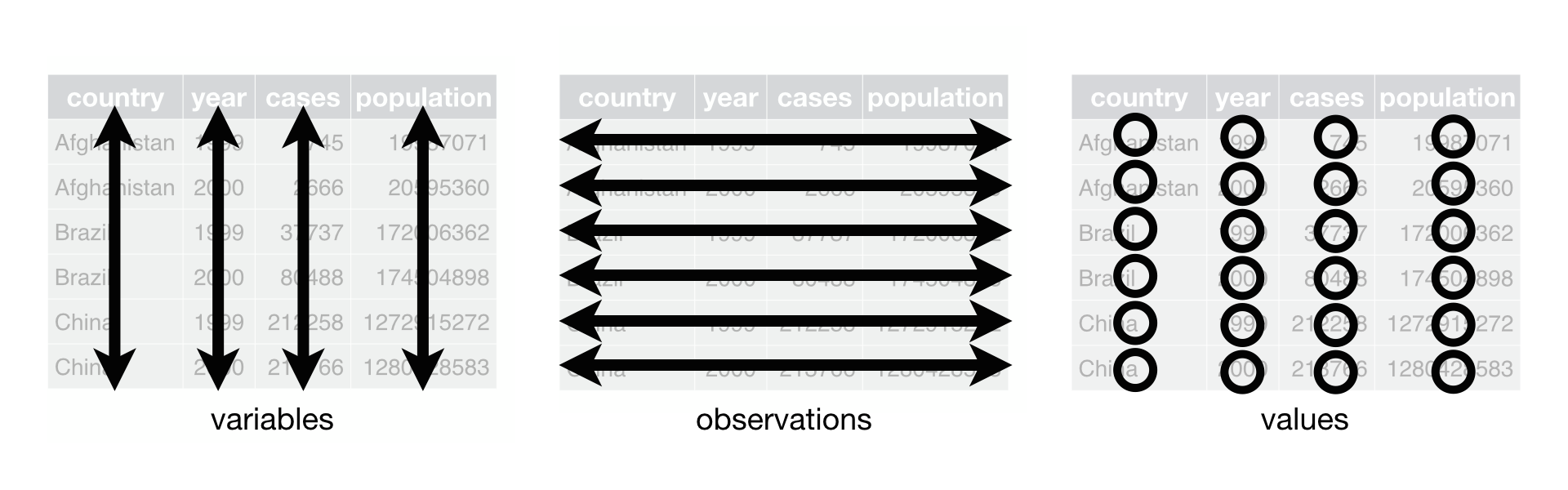
- Each observation forms a row
- Each variable forms a column
- Each type of observational unit forms a table
What is Tidy Data (Advanced)?
- Each observation forms a row: In other words, each row corresponds to a single observational unit
- Each variable forms a column:
- Some of the variables may be used to identify the observational units. For organizational purposes, it's generally better to put these in the left-hand columns
- Some of the variables may be observed values associated with each observational unit
- Each type of observational unit forms a table: Don't mix apples and oranges, keep apples with apples and oranges with oranges
nycflights13 Package
The nycflights13 package contains "tidy data" all 336,776 flights that departed from NYC (e.g. EWR, JFK and LGA) in 2013.
To help understand what causes delays, it also includes a number of other useful datasets.
weather: hourly meterological data for each airportplanes: construction information about each planeairports: airport names and locationsairlines: translation between two letter carrier codes and names
Lec02 - Thu 2/16: R Packages
Exercise
In small teams, take 3 minutes to write down
- A couple of male and female names that are "modern"
- A couple of male and female names that are "old-fashioned"
- One male and one female name that are "back in vogue"
Learning R
- Computers are stupid! You need to:
- Tell it exactly and everything it needs to do
- Everything needs to be perfect:
- Write everything from scratch
- Names of "stuff" need to typed exactly
- Parentheses need to match
- Recall: This is not a class on programming/coding. However, we'll learn just enough to do statistics and data science
- Side Benefit: Many of the concepts translate to almost all programming languages: python, javascript, etc.
Learning R
Recall the tradeoff:
| Less of this… | More of this… |
|---|---|
|
|
What are R Packages?
- Base R, i.e. R straight out of the box. It's fairly limited in power and functionality.
- R Packages are extensions to R that are
- contributed by a world-wide community of R users
- extend base R's functionality
- are downloadable over the internet from RStudio.
Step 1: How Do I Install a Package?
You need to install each package once.
- In RStudio: Go to Files Panel -> Packages -> Install
- Type in the package name and click install
- The procedure for updating a package is the same
Step 2: How Do I Load a Package?
You need to load a package everytime you want to use it.
- Run
library(PACKAGENAME)in the console.
Baby's First R Packages
Today's Learning Check: Install and then load 3 packages:
dplyr: a package for data manipulationggplot2: a package for data visualizationbabynames: a package of baby name data
babynames Package
The babynames package contains for each year from 1880 to 2013, the number of children born of each sex given each name in the United States. Only names with more than 5 occurrences are considered.
Lec01 - Mon 2/13: Introduction
Course Title
- In catalog: Introduction to Statistical Sciences
- New: Introduction to Statistical and Data Sciences
What is Data Science?

Data Science
- Example domains: biology, economics, physics, sociology, etc.
- So why the title switch?
Dialogue with Student

Course Objective #1
Have students engage in the data/science research pipeline in as faithful a manner as possible while maintaining a level suitable for novices.
- Cobb: Minimizing prerequisites to research
- Not necessarily publishing in top journals, but answering scientific questions with data.
- Difficult to do research without understanding stats, however
Data/Science Research Pipeline
We will, as best we can, perform all this:
Data/Science Research Pipeline
And not just this, as in many previous intro stats courses:

Course Objective #2
Foster a conceptual understanding of statistical topics and methods using simulation/resampling and real data whenever possible, rather than mathematical formulae.
- Whenever we can, use real data
- Example data set: nycflights13
- There are two "engines" that can make statistics "work"
- Mathematics: formulas, approximations, etc
- Computers: simulations, random number generation
The "Engine" of Statistics
In this course, computers and not math will be the "engine". What does this mean?
- Less of this:
- But more of this:
Programming/Coding
- Previous programming/coding experience is not a prerequisite to this course
- This course is not an explicit course on programming, coding, nor computer science. But we will use some elements.
- Also you will be exposed to basic algorithmic thinking and computational logic
- Learning R is like learning a foreign language: its really hard at first!
Two Simple Rules of Learning Code
- Computers are stupid!
- When learning, take existing code that works, and tweak it!
Course Objective #3
Blur the traditional lecture/lab dichotomy of introductory statistics courses by incorporating more computational and algorithmic thinking into the syllabus.
- Completely separate lecture and labs is a legacy of a time before

RStudio Server
- Not all laptops are created equal: operating system, processing power, age
- RStudio Server: cloud-based version of RStudio where all processing is done on Middlebury servers
go/rstudio/(on campus or via VPN)
Course Objective #5
Develop statistical literacy by, among other ways, tying in the curriculum to current events, demonstrating the importance statistics plays in society.
- H.G. Wells (paraphrased): "Statistical thinking will one day be as necessary for efficient citizenship as the ability to read and write."
- Me: "Sure, it's easy to lie with statistics. But it's also hard to tell the truth without them."
Final Project
- Capstone experience to align this topics and principles of this course with how research and learning is done in practice.
- Work on interpersonal and collaborative skills. No textbook on that!
Lecture Format
Either
- Lab format: With laptop
- You sit in groups of 4
- I'll talk for 10-15 minutes before you work on learning checks
- Chalk talk: Old-school
- Keep desk in rows
- More traditional lecture format
Let's Build our Toolbox

R, RStudio, and DataCamp
- R: Software behind the scenes i.e. the engine
- RStudio: Intergrated development environment i.e. the interface
- DataCamp: Browser-based learning tool i.e. the driver's ed teacher
Analogy
| R | RStudio | DataCamp |
|---|---|---|
 |
 |
 |
Test Drive RStudio
- Login to
go/rstudio/with your Midd account - If you don't have access, raise your hand. (Username: guest1, password: rstudioguest)
- In RStudio menu bar -> File -> New File -> R Script
The Four Panels
- Console: Crunch numbers in R
- Files, Packages, Help: See your files, install packages, help files
- Editor: Where you'll write code and save it
- Environment: Your workspace
Important: Console
- This is where you run/execute commands
- The ">" is the prompt. It means R is ready to receive commands
- If you don’t see a ">" and want to restart, press ESC.
Switching Gears
Now we will use R via DataCamp instead of via RStudio, but just for driver's ed. Two panels exist in both:
- Editor panel: Where you write code
- Console panel: Where you will execute code